Requirements
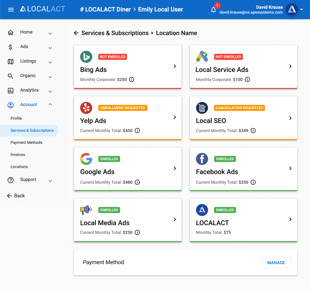
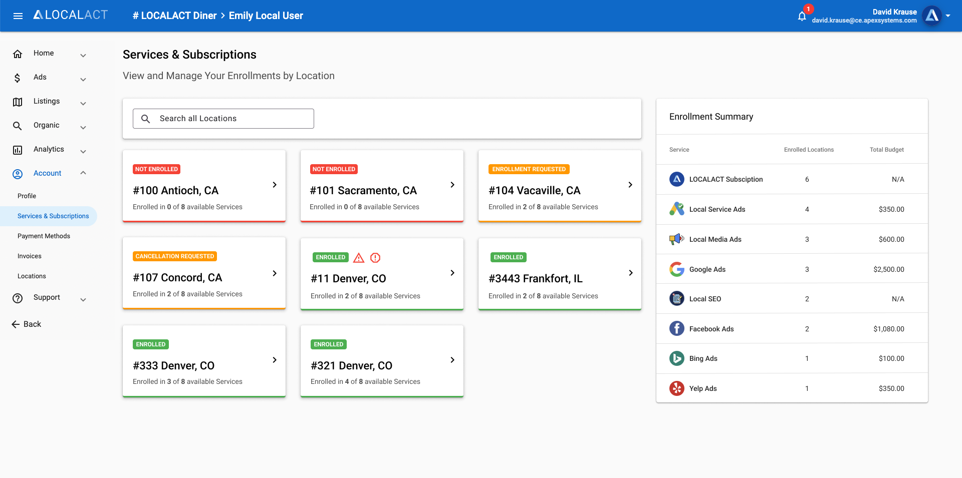
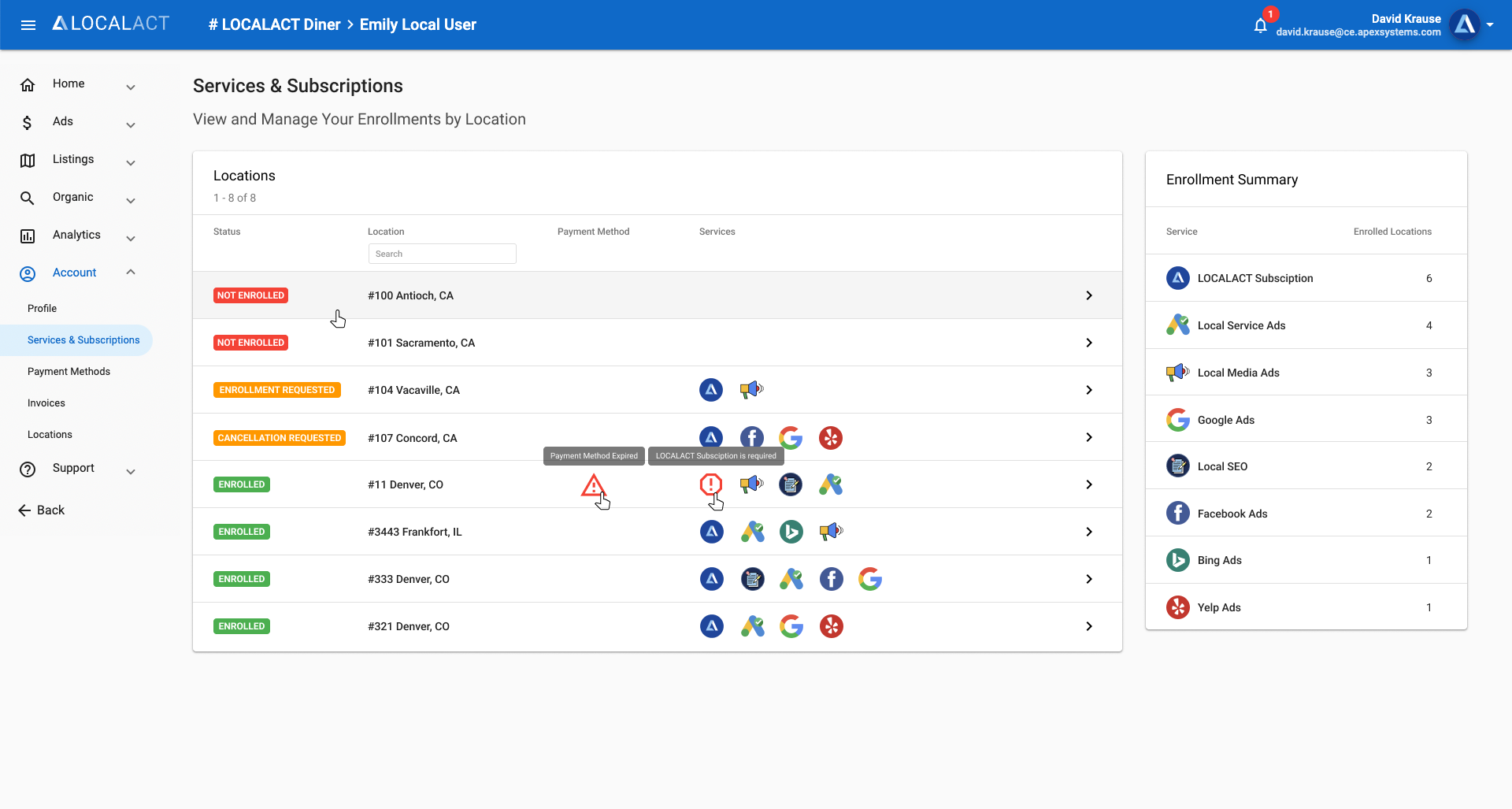
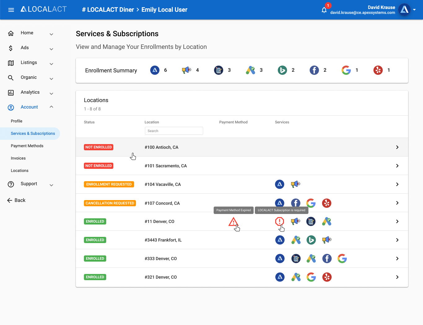
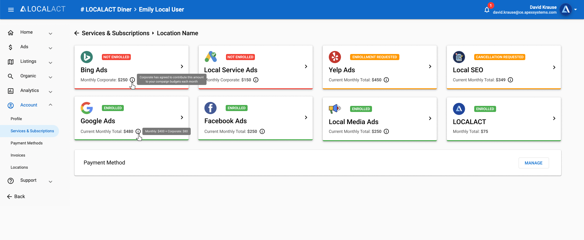
Redesign a couple list pages where users will first select a location, then select a service/subscription to manage. Locations should show the services they are enrolled in along with any system warnings for each. Users needed the ability to search for a specific location. The page should also have an Enrollment Summary component. Each service/subscription must include a logo, title, status, and current monthly fee breakdown. They were to be ordered by status, beginning with ones that were “Not Enrolled”.
Solution
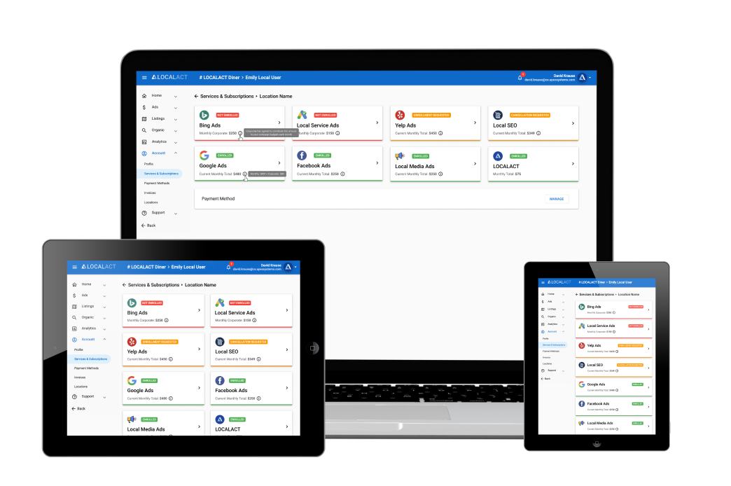
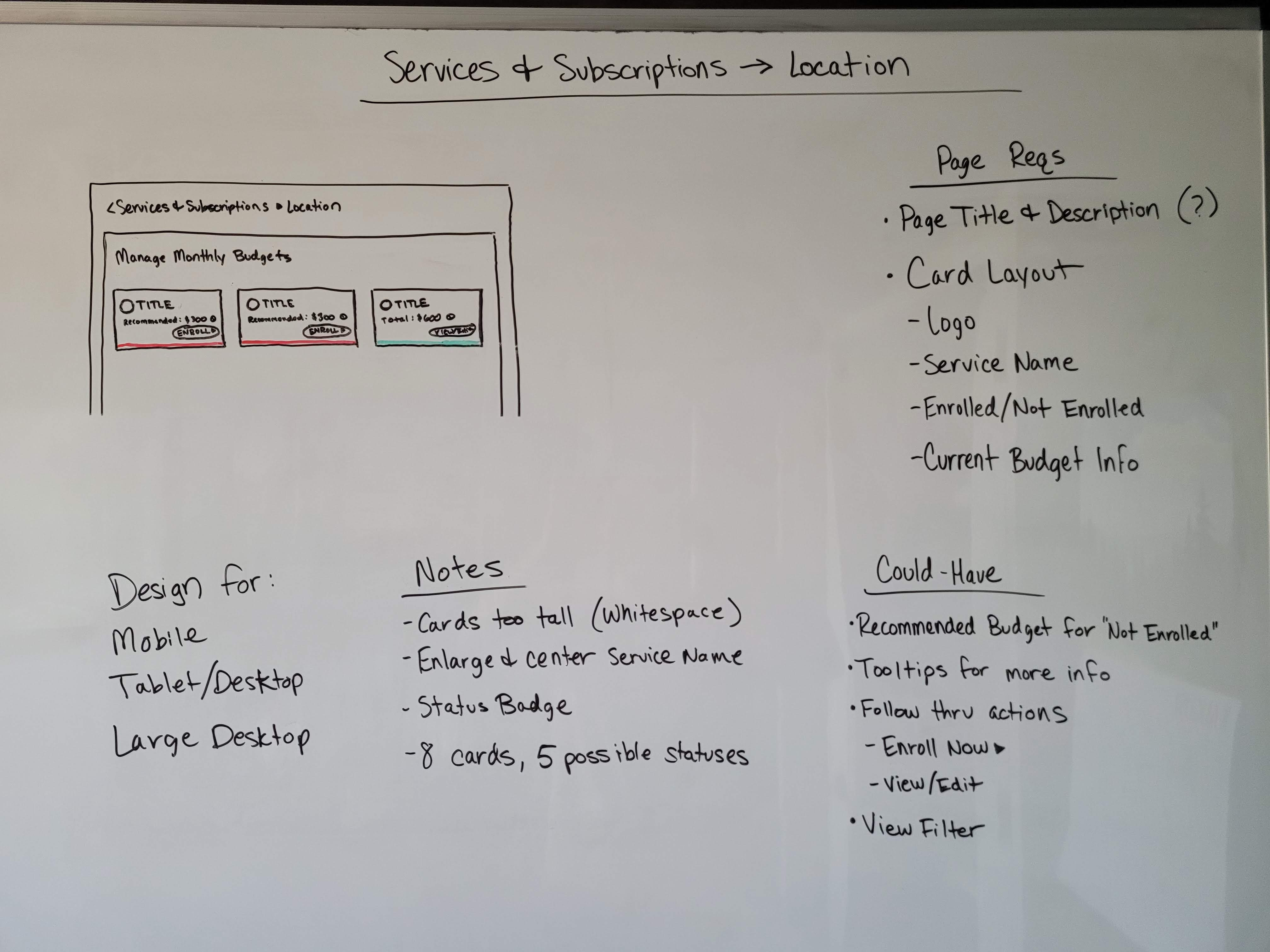
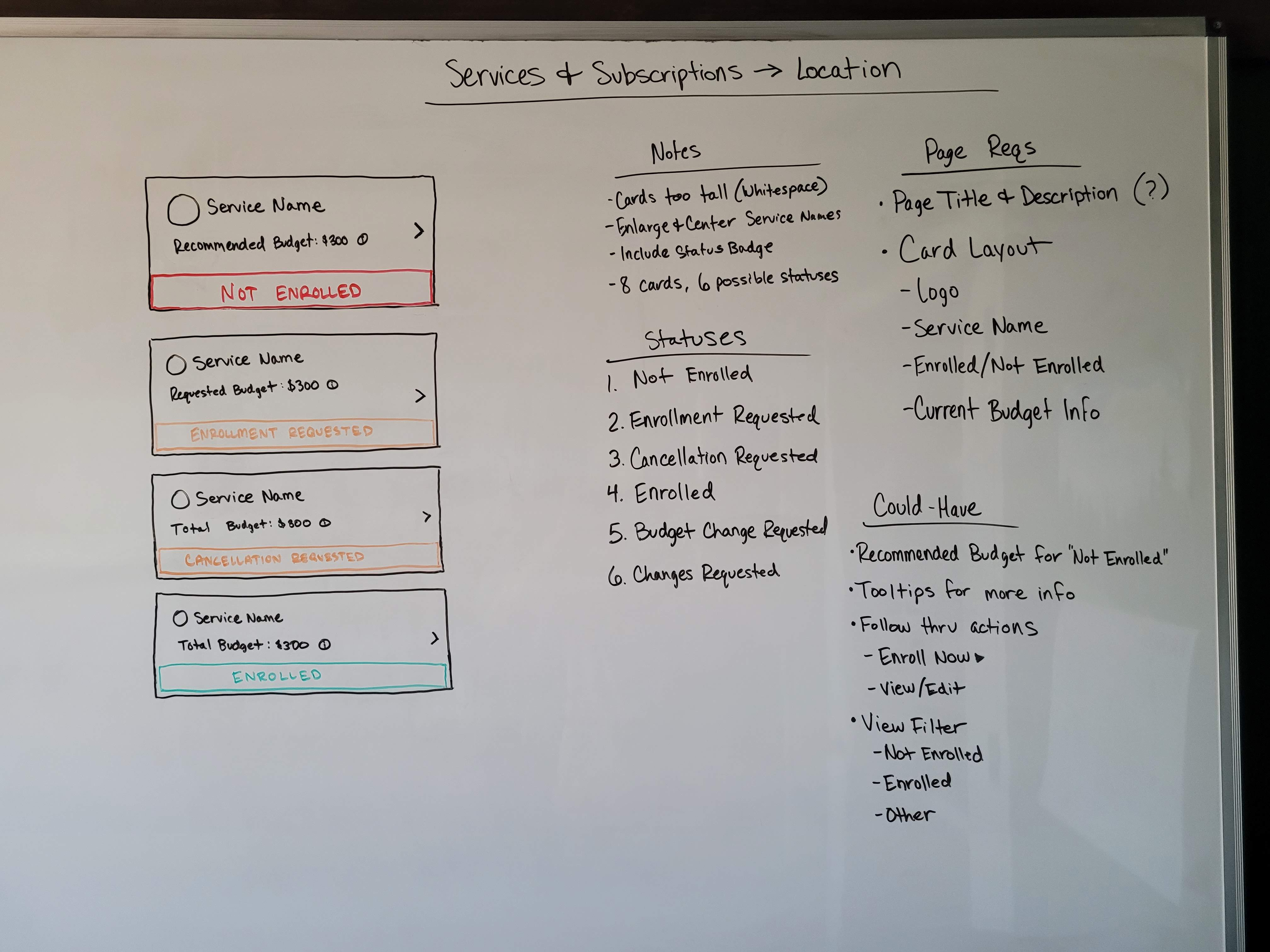
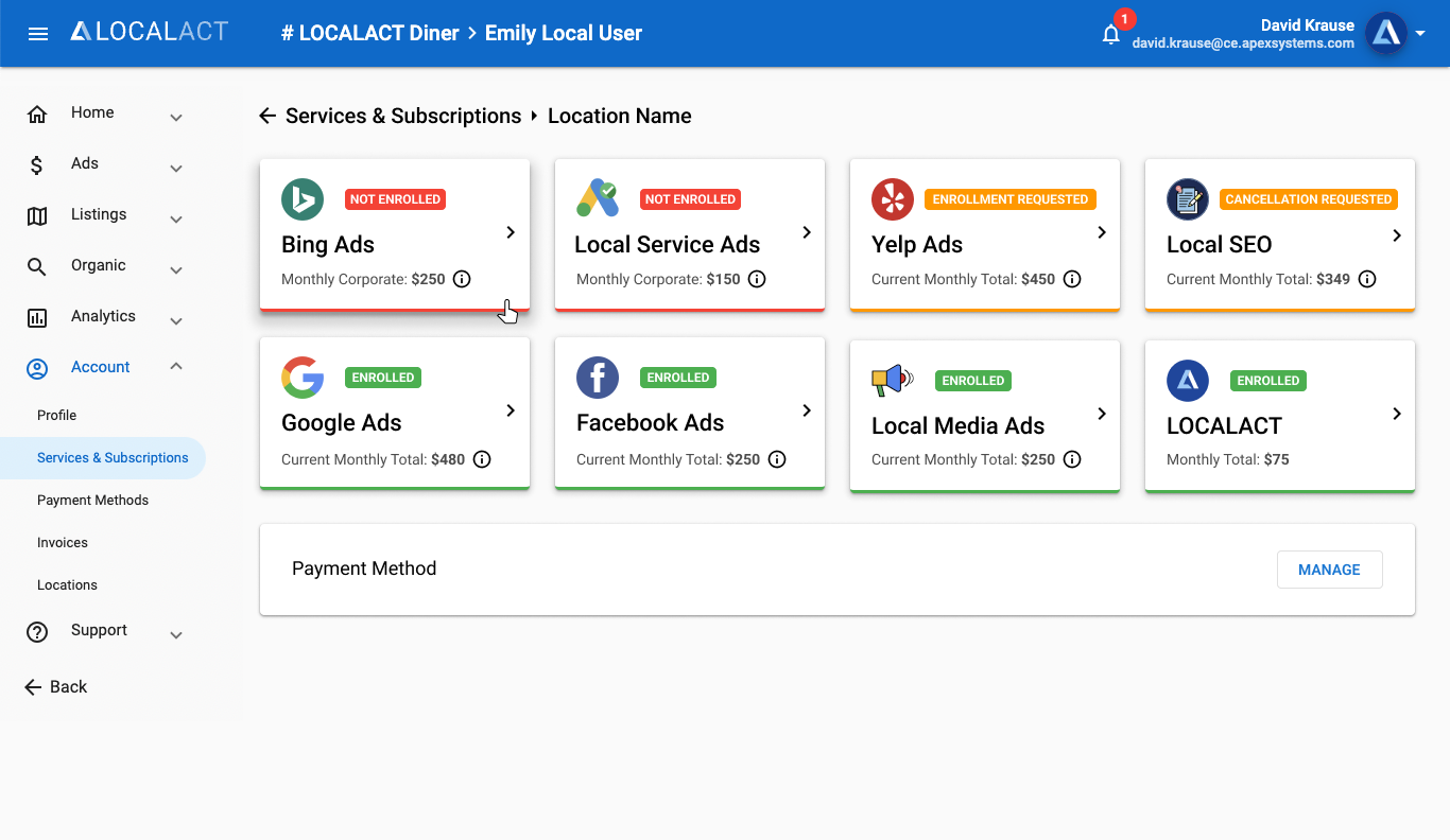
This project began in the middle of the Monthly Budget Management project as the preceding page. I had a solid understanding of the loose design system currently being used throughout the app and some design standards that I had previously established in my pocket. I wanted to continue the card-based layout that users would soon get accustomed to. I knew that the statuses were important on this page due to the ordering, so I wanted to draw attention to those using color. I also wanted to reduce the visible clutter on this page by putting the monthly fee breakdown into a hover tooltip, like on the MBM page. I started at the whiteboard, by listing out requirements and ideas.
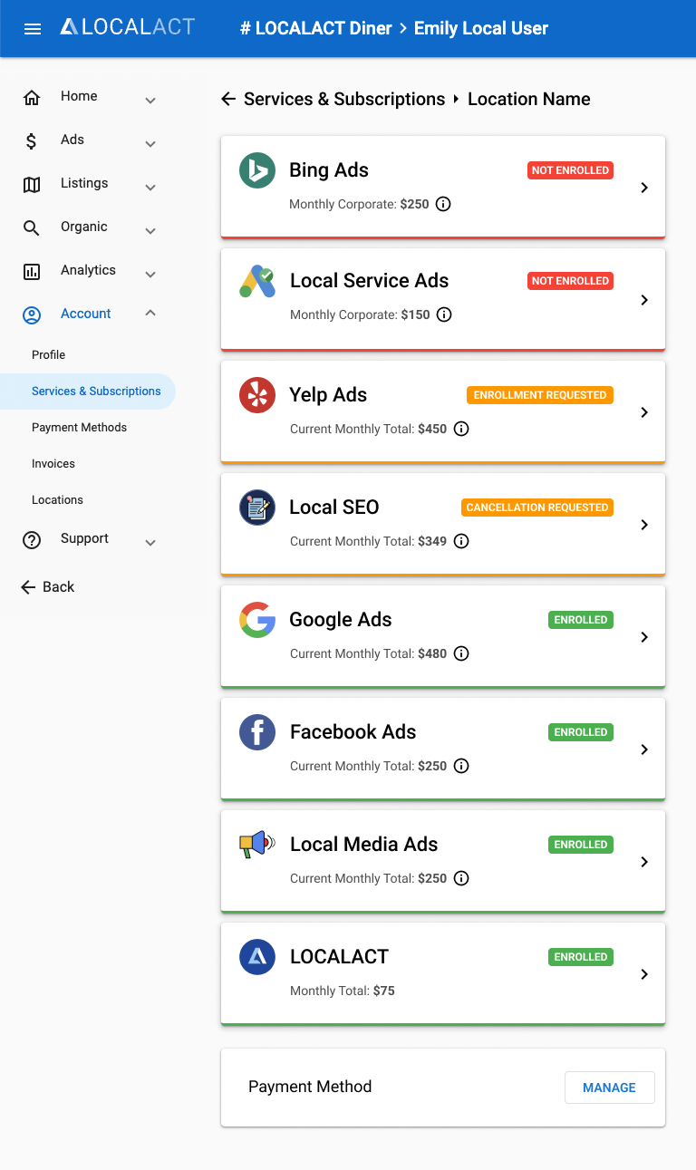
I started with the individual service card designs, as I was told to start on the specific Location page first. This page was fairly straight forward and did not require wireframes or multiple rounds of review. Once the service card layout was approved I added them all to a page to show the various statuses. I designed a version for all of the different break points to ensure the design wouldn't break the page. Designs were approved and I built this fully-responsive page.
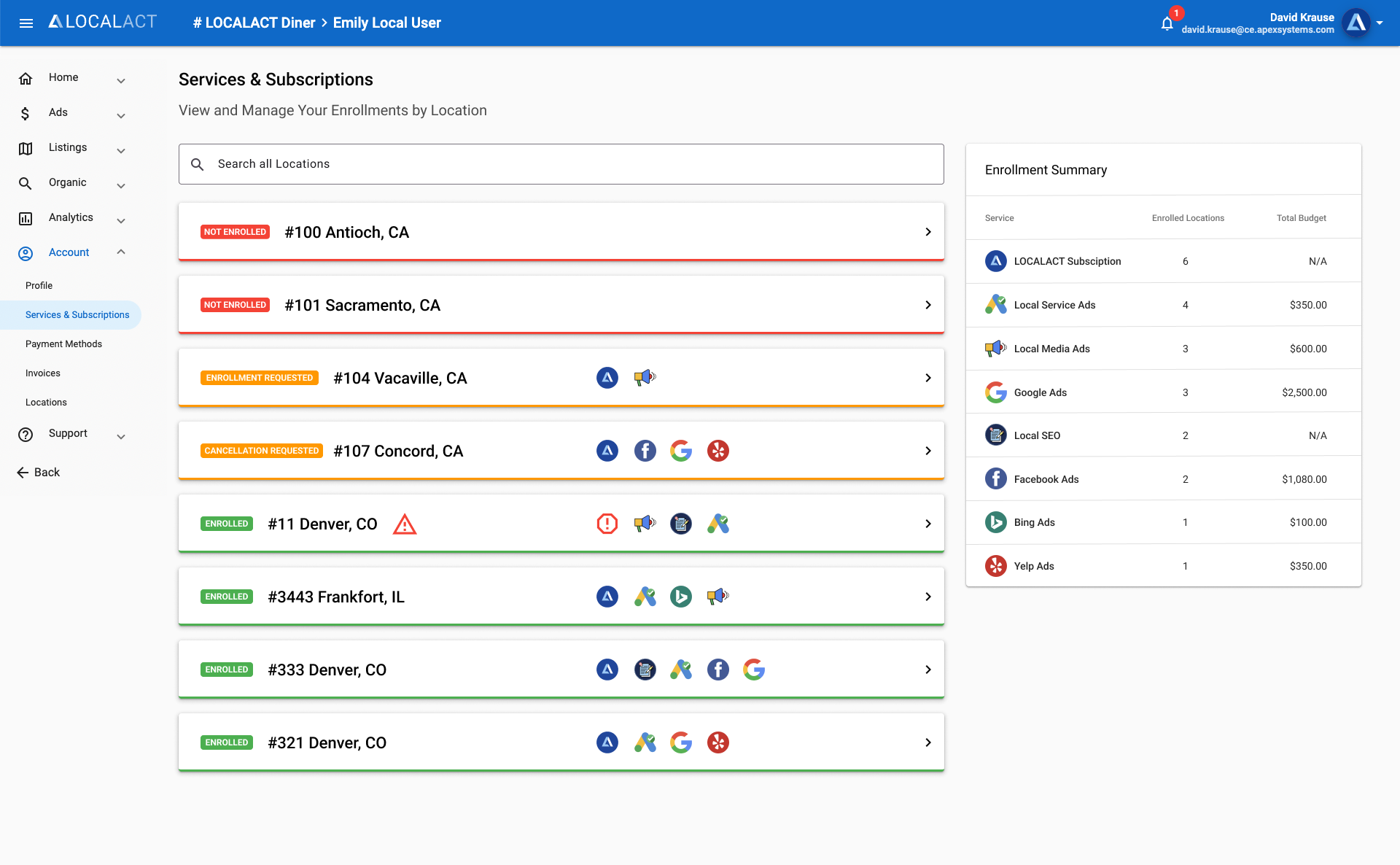
For the Location selection page, we needed to add new functionality to display the enrolled services. I created several different versions for stakeholders to choose from. I wanted to stick close to the designs that were included on the next page and monthly budget page. However, the long lists of locations for some accounts made it difficult to get away from the table list layout.
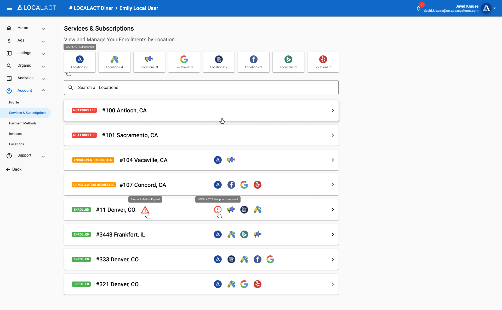
Stakeholders liked the design options, but the developers thought this layout would be too complicated for the search functionality. In an effort to save time we compromised on a table layout with built-in search functionality. This page did not require my front-end development skills.
Regrets
I designed and edited many different card layouts for each service before landing on a single design, instead of creating a component and adding variants in Figma, which would have saved time. I wish I had consulted with the developers sooner on the Locations page. Knowing that we would be limited to a table layout, this project would have been much quicker.
Lessons Learned
Realizing now that we were working backwards in the page hierarchy, with another preceding page design request after this, I thought it would have been much easier to start at the beginning to see the whole picture. But sometimes stakeholders want to see the flashy new features first, and you have to adapt.
