When I joined Location3, the homepage of the LOCALACT platform was a collection of data tables and seldom used or updated resource links. Through research using analytics data, we could see that users spent very little time on
the homepage. In most cases, simply waiting for it to load in order to gain access to the main menu. Through direct feedback from support and account teams, we knew that users were frustrated with the platform, especially the
homepage. This was our user's first impression and gateway to the rest of the platform. We needed to add value, fast.
Problems
Users did not understand how to interpret the data on the homepage.
Support and account management teams were overwhelmed by users calling for help with interpreting their data and complaining about the usefulness of the homepage.
Homepage had no action items for the product team to measure user engagement.
Users could not engage with the main menu or other content until the entire page was loaded.
Homepage before redesign
Project Goals
Increase user engagement on the homepage by creating a dashboard to visualize data.
Create calls to action on the homepage to better measure engagement internally.
Reduce user interactions with support and account teams by making the homepage easier to understand.
Load page components individually to decrease loading time and enable users to get where they want faster.
My Role
I led the end-to-end design process and contributed to the front-end development on the final product. I worked with a product manager and two developers.
Requirements Gathering
With the problems and goals clearly defined, I began gathering additional requirements by interviewing and surveying stakeholders, support team leaders, and account managers. I wanted to understand the most common pain points for users
on the homepage based on direct feedback and support tickets. I also wanted their input on how to solve some of the problems in the UI. This helped give me a starting point for a minimum viable solution. The general consensus was
that they wanted to see more charts/graphs to display the data changes over time. This would enable users to make budget decisions based on their data, thus increasing automated revenue through the platform, without requiring an
interaction with the team.
It was also determined that stakeholders did not want users to see spending amounts on the homepage. This data gave some users a negative interpretation of their key performance indicators when compared to the amount they were spending.
It would also encourage users to dive deeper into the platform to see spending data.
Additional Requirements
Include charts/graphs in the homepage UI.
Remove spending data from the homepage.
Create a new “Reviews” section for Google Reviews and Facebook Recommendations based on data from an internal page.
Whiteboard & Wireframes
As I do with most projects, I started with a blank whiteboard. First, I listed out all of the current content and data with notes to remove and expand specific sections. Based on those metrics, I sketched out an idea for the page layout,
incorporating placeholders for charts/graphs and simple number graphics to show the change over time. I also included links within each section to connect the homepage data to other pages in the platform. Then I created wireframes
using Figma to review with the team.
V1: Requirements gathering and whiteboard ideasV1: Wireframe created in Figma
Team Review
During our first team review it was determined that adding any charts/graphs would be out of scope for this project. The developers informed me that the historical data required for the requested charts did not exist yet. They would
begin tracking that data but it would not be available for visualization on the homepage for an undisclosed period of time. We compromised on increasing the visibility of the simple positive/negative change over 30 days.
Knowing that users seldom clicked on the “Learn More” resource links, I recommended that we place that section into an easily accessible dropdown panel in the header. This would make it accessible throughout the user journey, and encourage
others to add new content and notify the user with a badge on the icon. The team agreed.
Additional Requirements
Remove the charts from the wireframe.
Increase the visibility of the 30 day trend data.
Move the “Learn More” section to the header.
Add a text description for each metric.
Include service filters for the metrics.
I created a new version of the wireframe with the new requirements in mind. I did not want to overwhelm the user with text, so I hid the metric descriptions behind a hover tooltip. This would allow the user to learn what the
metric is, without having to see the description every time they visit the homepage. I included simple toggle buttons at the top to filter the data by services on the page. This version was approved by the team, so I began
designing in full color.
V2: Wireframe created in Figma
Designs
I used common design patterns to create the new homepage dashboard in Figma. While reviewing these designs, it was determined that users would need the ability to filter the sections separately, as the services may not be the same
for both sections. Stakeholders also express the desire to highlight services that users are not enrolled in. With that feedback, I created a new version with the sections in individual cards.
V1: Design created in Figma, based on V2 wireframeV2: Design created in Figma, based on V1 design feedback
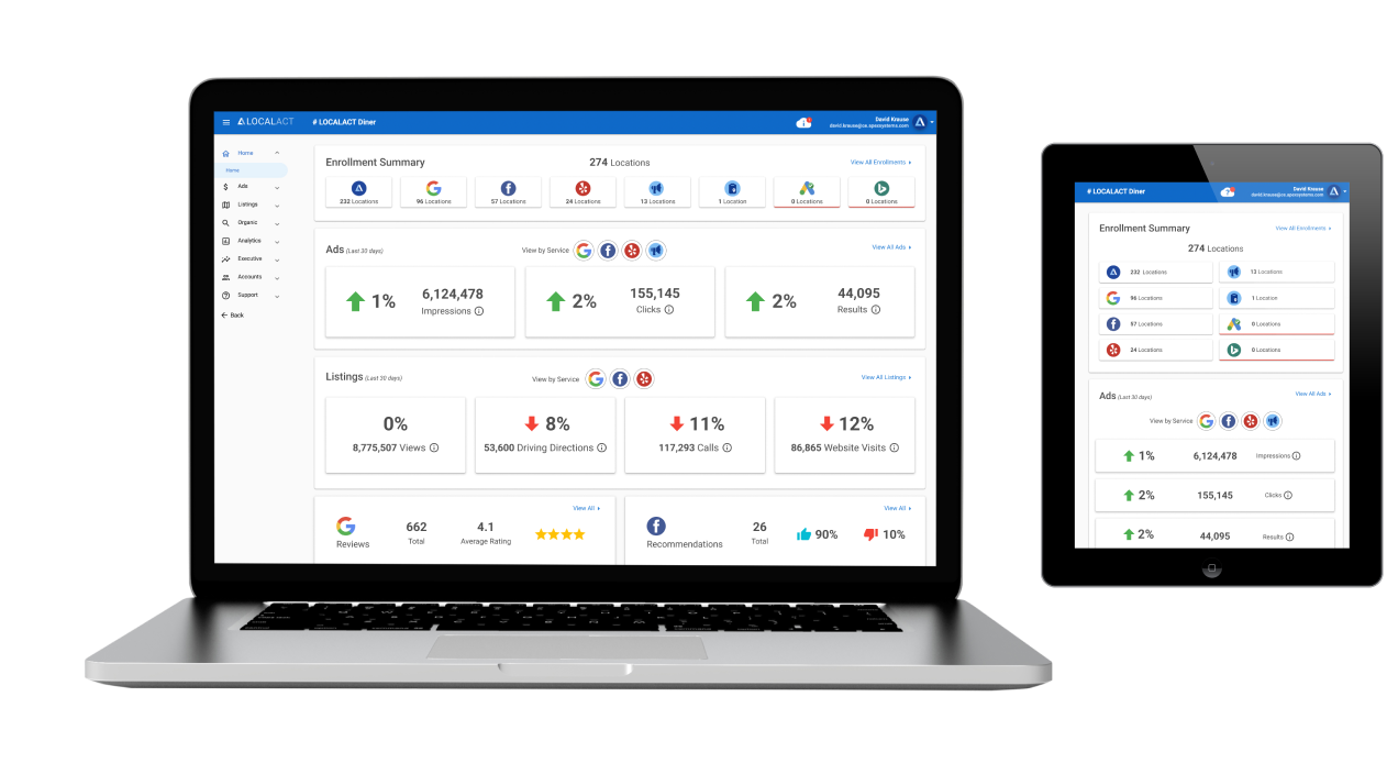
Final Designs
Once this round of review was completed, we were nearly there. The feedback from stakeholders was positive. The only design tweak we needed to make was removing the enrolled locations count from the filter buttons. I created 3 designs
to show how the layout would break down as the browser width decreases. Note: this app was never intended to be mobile friendly for phones, so we only designed it down to tablet size.
V3: Design created in Figma, based on V2 feedback (1920px and up)V3: Design created in Figma (1366px and 1919px)
V3: Design created in Figma (1024px and below)
Development & Release Contributions
I built the fully-responsive UI foundation in Visual Studio Code with HTML5 and CSS3 in an Angular environment. I then handed it off to the developers who made the page functional. Once that was complete, I helped with QA to get it
across the finish line and ready for deployment.
Project Goal Results
Stakeholders and users were delighted by the homepage redesign. User engagement on the homepage was up 100% within a week of release. They were staying on the page much longer and using the new in-page links to drill deeper into
their data. However, there were some unintended consequences of showing the 30 day trends in data. Users who were seeing negative trends wanted to know why and how it could be reversed. This update did not include features
to address those user needs. We knew that another update would be required.
Increase user engagement on the homepage by creating a dashboard to visualize data.
Create calls to action on the homepage to better measure engagement internally.
Reduce user interactions with support and account teams by making the homepage easier to understand.
Load page components individually to decrease loading time and enable users to get where they want faster.


")
")
")