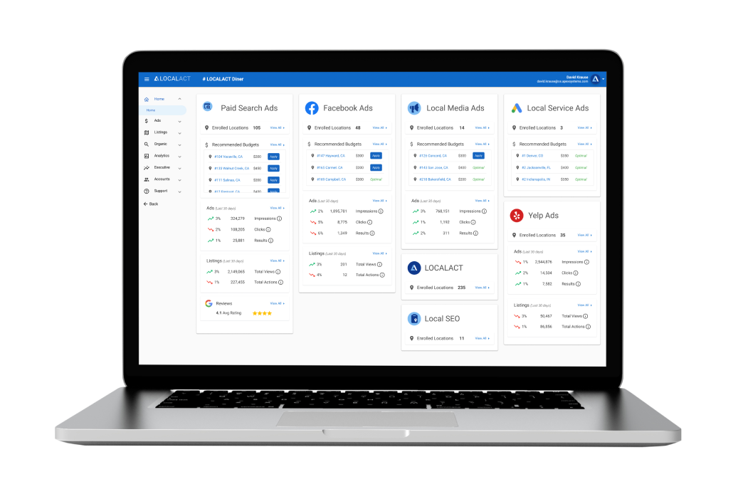
After the first homepage redesign we began to gather more data on how users preferred to see their key performance indicators and interact with the platform. Stakeholders had expressed concerns over the showing the negative trends in data so prominently on the homepage, without giving further context. We also had received feedback that the filter functionality was not clear to some users. There was also a desire among stakeholders to differentiate the data types between each service and to add a revenue generating feature to the homepage to apply budget recommendations.
I led the end-to-end design process and contributed to the front-end development on the final product. I worked with a product manager and a developer.
Since this was more of a proactive project for me, I worked on it in between other project work, with the approval of my team. I knew that we made significant improvements to the UI and UX with our first homepage redesign, but did
not fully hit the mark. With the addition of the recommended budgets feature, it was a great opportunity to further improve the dashboard for users.
I began sketching out ideas and quickly came to the realization that
the layout of the dashboard would need to be based on the services rather than the data categories. This would allow us to remove the filters, customize the data displayed for each service, and show more accurate data trends. Once
I proposed this idea to the team, everyone was on board. Wireframes not needed.
Knowing all of the data required for each service, I designed a component example that included all possible data and could be used for all services.
Upon reviewing the component with the team, it was determined that we would need to show all enrolled locations for each service. For many users, this meant showing less than 5 locations, but for some it meant showing over a hundred. Stakeholders also requested we remove the Facebook Recommendations section as it was only applicable to a few users.
I designed out the full page with all possible services and data shown. The Recommended Budgets section has a maximum height applied with a partial listing showing to prompt the user to scroll to see all locations. It also
has a loading icon to display how the section will lazy load.
The new designs were a hit with stakeholders. Previous concerns about negative data trends and filter usability were alleviated. They were excited
about the new layout and opportunities within each service component. Last thing we needed was to design the user flow for applying a recommended budget.
I sketched out some quick ideas and then began designing in Figma. I wanted to make sure this process kept the user on the homepage in order to quickly apply all of their recommended budgets without leaving the dashboard experience. As well as seeing their updates confirmed in real-time. A modal window seemed like the best option.
I built the fully-responsive UI foundation in Visual Studio Code with HTML5 and CSS3 in an Angular environment. I then handed it off to the developer who made the page functional. Once that was complete, I helped with QA to get it across the finish line and ready for deployment.
Stakeholders loved the new homepage. It earned the team more trust within the organization, allowing us to bring more ideas to the table.